Leather colours are one of the most powerful tools in a B2B product designer’s toolkit — and one of the most underappreciated. When a customer walks into a furniture showroom, sits in a car, or unboxes a luxury product, the color of the leather is often the first thing they notice, and it frequently drives the final buying decision. Yet many buyers treat color selection as an afterthought — something to finalize after all the “important” technical decisions are made.
After more than a decade working with European furniture brands, automotive OEMs, and luxury goods designers, I’ve seen firsthand how the right leather color palette can make a product line a runaway success — and how the wrong colors can leave even well-designed products gathering dust. This guide covers the psychology of leather colours, the dominant trends shaping European markets in 2026, and a strategic framework for choosing colors that align with your brand and sell more product.
Browse Our Leather Colour Range
The Psychology of Leather Colours
Color psychology isn’t just marketing fluff — it’s grounded in how our brains process visual information and emotional responses. Different hues trigger different associations, and these associations directly influence purchasing behavior. Here’s what the most popular leather colours communicate:
| Leather Colour | Key Associations | Best For |
|---|---|---|
| Tan / Cognac | Warmth, quality, craftsmanship, approachability | Premium furniture, heritage brands, lifestyle products |
| Black | Luxury, sophistication, power, timelessness | High-end automotive, executive furniture, formal goods |
| Chocolate Brown | Reliability, comfort, tradition, durability | Classic furniture, office seating, residential |
| Grey / Taupe | Modernity, calm, neutrality, versatility | Contemporary furniture, contract interiors, minimalist design |
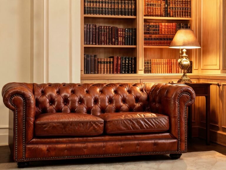
| Burgundy / Oxblood | Opulence, tradition, heritage, exclusivity | Luxury goods, classic Chesterfields, high-end accessories |
| White / Cream | Purity, luxury, modernity, spaciousness | Premium automotive, minimalist furniture, showroom pieces |
| Navy Blue | Trust, professionalism, calm, authority | Office furniture, marine upholstery, professional settings |
| Green / Olive | Nature, calm, growth, uniqueness | Eco-conscious brands, boutique furniture, accent pieces |
The key insight here is that color communicates before words do. A customer might read your product description and review your technical specs, but their emotional response to the color happens instantly and subconsciously. If the color doesn’t feel right for your brand positioning, all the technical features in the world won’t close the sale.

Strategic leather colour selection is about more than aesthetics — it’s about aligning visual identity with brand positioning and customer expectations.
European Leather Colour Trends for 2026
European design trends have always been a bellwether for the global leather industry. What’s popular in Milan, Copenhagen, and London today will be mainstream in New York, Sydney, and Dubai in 18–24 months. Here are the dominant leather colour trends shaping European markets in 2026:
1. Warm Earth Tones — Still Going Strong
Earthy shades continue to dominate European interiors. Caramel, walnut, chocolate brown, and deep espresso are everywhere — from Scandinavian minimalist sofas to British Chesterfield chairs. These colors create a sense of grounding and calm, which aligns perfectly with the post-pandemic desire for home comfort and biophilic design.
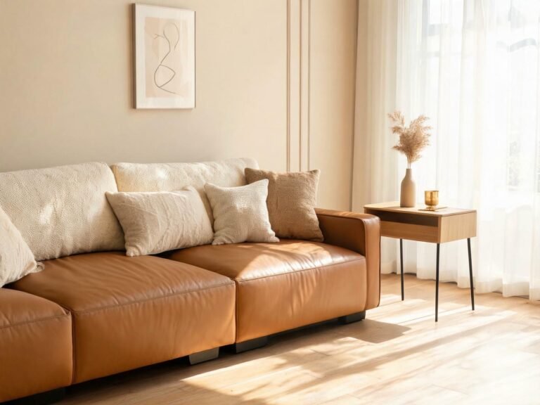
What’s new in 2026 is the shift toward warmer undertones. Grey-browns and taupe had their moment, but now we’re seeing richer, more golden browns — cognac, amber, and honey tones are on the rise. These shades bring more warmth and personality than neutral greys while remaining versatile enough to work with most interior schemes.
2. Light and Airy Neutrals
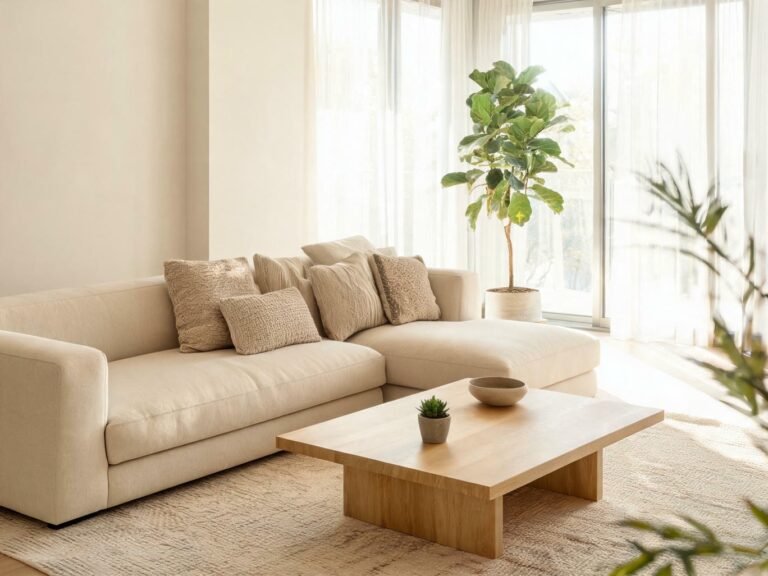
Sand, ivory, bone, and off-white leather colours are growing rapidly, especially in premium automotive and contemporary furniture. Light leather creates a feeling of spaciousness, luxury, and modernity — which is why it’s become a signature of high-end electric vehicle interiors. In furniture, light leather works beautifully with the pale woods, marble, and brushed metals that define contemporary European design.
The challenge with light leather has always been practicality — it shows dirt, stains, and wear more visibly than darker shades. But advances in synthetic leather technology, particularly stain-resistant silicone leather, are making light colours viable for high-use applications that previously required darker leather. This is a game-changer for designers who want the aesthetic of light leather without the maintenance concerns.
3. The New Neutral: Mushroom and Greige
If you follow interior design trends, you’ve probably heard of greige (grey + beige) and mushroom tones. These soft, ambiguous neutrals are the fastest-growing leather colour category in European contract and residential markets. What makes them special is their chameleon-like quality — they read as warm in warm light and cool in cool light, making them incredibly versatile across different design schemes.
For B2B buyers, mushroom and greige are smart choices because they appeal to a broad range of customers without being boring. Unlike stark white or heavy black, these soft neutrals create a gentle backdrop that lets texture — grain, pebbled finish, suede — take center stage. In premium leather products where texture quality is a selling point, this is a significant advantage.
4. Bold Accent Colours
While neutral leather colours dominate main furniture pieces, bold accent colours are trending for statement pieces — armchairs, bar stools, headboards, and decorative accessories. Deep burgundy, forest green, burnt orange, and even muted teal are showing up in European design collections as way to add personality and visual interest to neutral-dominated spaces.
The key with bold leather colours is to use them strategically — as single accent pieces rather than entire suites. A burgundy Chesterfield armchair in a room of neutral furniture creates a focal point and adds a touch of luxury that no amount of accessories can match. For B2B buyers, offering one or two bold colour options alongside a core neutral range can help your products stand out in a crowded market.
5. Matte Finishes Across All Colours
This isn’t a colour trend per se, but it affects how every colour looks and feels. Matte and semi-matte leather finishes are replacing high-gloss finishes across all colour categories. Matte leather has a more natural, understated luxury feel — it doesn’t scream “expensive” the way glossy leather does; it whispers it. The matte trend is strongest in automotive interiors and contemporary furniture, where it aligns with the broader move toward quiet luxury and understated design.
Regional variation note: Leather colour preferences vary across Europe. Northern European markets (Scandinavia, Germany, Netherlands) lean toward lighter neutrals, greys, and muted tones. Southern European markets (Italy, Spain, France) favor richer browns, warmer tones, and more accent colors. The UK sits somewhere in between — historically leaning traditional, but rapidly adopting continental modern trends. If you sell across multiple European markets, consider a tiered colour strategy with region-specific bestsellers.
How to Choose the Right Leather Colour Palette for Your Products
With hundreds of leather colours available, choosing the right palette for your product line can feel overwhelming. Here’s a strategic framework that B2B brands use to make smart colour decisions:
Step 1: Start with your brand identity
Your leather colours should reinforce your brand identity, not fight against it. If your brand is about heritage craftsmanship, warm browns and tans will feel authentic. If your brand is about modern luxury, greys, whites, and deep blacks make more sense. If your brand is eco-conscious, natural earth tones and forest greens will resonate. Before you look at a single swatch, define what emotions and values you want your products to communicate — then choose colours that support that.
Step 2: Build a balanced palette structure
A well-designed leather colour palette has four tiers, each serving a different purpose:
- Core neutrals (3–4 colours) — The workhorses of your line. These are the colours that will make up 70–80% of your sales. Choose versatile, broad-appeal neutrals: black, brown, tan, and grey/taupe.
- Fashion neutrals (2–3 colours) — On-trend soft neutrals that add sophistication to your range. Mushroom, sand, greige, and warm ivory fall into this category.
- Statement colours (1–2 colours) — Bold colours for accent pieces and customers who want something different. Burgundy, navy, forest green, or burnt orange work well.
- Limited-edition / seasonal colours (1 colour) — A rotating colour that keeps your line feeling fresh. Change it annually or bi-annually to encourage repeat visits and create urgency.
Step 3: Consider your sales channel and customer
Different sales channels and customer segments prefer different colours. Contract furniture buyers tend to play it safe with neutral colours because they need pieces that work in a variety of commercial spaces. Residential furniture buyers are more adventurous and more likely to choose statement colours. Online shoppers lean toward safe, versatile colours (black, brown, grey) because they can’t see the product in person. Retail showroom shoppers are more willing to try unique colours because they can see and feel them. Make sure your colour palette matches how and where your customers buy.
Step 4: Test before you commit
Never choose leather colours based on digital images alone. Colour accuracy on screens is notoriously unreliable — what looks like a warm medium brown on your monitor might be a cool dark brown in person. Always order physical samples, evaluate them in natural light, and if possible, test them with real customers. Even small colour differences can have a big impact on sales performance.

Always evaluate leather colour samples in person under natural light — digital images and screen colours are notoriously inaccurate for material selection.
Genuine vs. Synthetic Leather Colour Capabilities
The material you choose has a big impact on your colour options. Here’s how genuine leather and premium silicone leather compare on colour capabilities:
| Colour Aspect | Genuine Leather | Silicone Leather |
|---|---|---|
| Colour Range | Moderate — limited by hide absorption | Unlimited — any colour possible |
| Custom Colour Matching | Approximate, 4–6 week lead time | Precise Pantone, 10–15 days |
| Colour Consistency | Natural variation between hides | Perfectly uniform across every yard |
| Light Fastness | Good for darker colours; fair for light | Excellent across all colours (Grade 4+) |
| Colour Depth | Rich, natural depth from hide | Consistent, even colour throughout |
| Stain Resistance (light colours) | Poor — requires careful maintenance | Excellent — stain-proof, easy to clean |
| Special Effects | Limited — distressing, burnishing | Wide range — metallic, pearlescent, two-tone |
The takeaway: if colour is a critical part of your product strategy — whether that means precise brand colour matching, on-trend fashion colours, or perfectly consistent colour across large installations — synthetic leather gives you significantly more control and flexibility than genuine leather. For products where colour accuracy and consistency are paramount, this is a major advantage.
Practical Tips for Managing Leather Colour in Production
- Set clear colour standards — Provide your supplier with physical master samples or precise Pantone references, not just digital images. Document acceptance tolerances (e.g., ΔE ≤ 2.0 for core colours).
- Request shipment samples — Always approve a production sample before a full order ships. Colour can shift between batches, and catching it before shipment saves time and money.
- Consider colour fastness requirements — Different applications need different levels of light fastness, rub fastness, and perspiration fastness. Specify your requirements upfront — don’t assume the supplier knows your needs.
- Plan for colour trends with buffer stock — Fashion colours come and go. Don’t overcommit to a trendy colour unless you’re confident it will sell through. Use limited-edition strategies to test new colours before scaling up.
- Document everything — Keep records of approved colour standards, supplier references, and batch approvals. This makes it much easier to resolve colour disputes and maintain consistency across orders and suppliers.
Leather colours are far more than decorative — they’re a strategic tool that shapes customer perception, drives buying decisions, and differentiates your products from competitors. By understanding the psychology of colour, staying current with European trends, and choosing a material that gives you the colour capabilities you need, you can build a leather product line that looks great, sells well, and reinforces your brand identity.
If you’re exploring leather colour options for a new product line and want to see what’s possible with premium silicone leather, our sample kit includes 40+ standard colours and information about custom Pantone matching.
About TOPSUN
TOPSUN manufactures premium silicone leather in 40+ standard colours with precise Pantone custom matching — delivering perfectly consistent, stain-proof, fade-resistant leather colours for furniture, automotive, healthcare, and consumer electronics applications across European and global markets.
40+ colours · Precise Pantone matching · Perfect consistency · Grade 4+ light fastness · Stain-proof · Zero VOC · ISO & REACH certified